Expert Logo Design Tips 2018: How important is your branding?
We ask the experts…
At Outstanding Branding, we spend a lot of time working with the logos and branding of a wide spectrum of companies and organisations, creating bespoke solutions for campaigns and events.
Just by simply branding up an item such as a pen, or something more high end like a wireless charger, you have not just a great promotional gift, but an item that will stay with the recipient for a good while, increasing your brand’s exposure
But how can you get the most out of this sort of product? If you’ve got a fairly basic, forgettable logo, the effectiveness of promotional merchandise is going to be low. So what does it take to make your logo and brand shine? We got in touch with a number of expert logo designers and branding agencies from across the UK & Ireland to ask them their opinion on the matter, asking them the following questions:
1. Why is a strong logo and branding so important for a business?
2. In 2018, what elements and ideas specifically increase a logo’s effectiveness?
Here’s what they had to say…

Ian Morris – Threerooms
Logo design has matured over the years, from a crude badge of recognition, dating back as early as ancient Egypt, to the rise of commercialisation in the 50’s to 70’s, where brands learned to become more emotive. From the 80’s onwards, brands progressively grew more sophisticated, reflecting the market’s maturity and willingness to be challenged.
As we race towards the 2020s, we design with dialled-back simplicity and a more delicate approach. Modern audiences are highly tuned and self-aware. Today, we focus on finding and presenting the essence of a brand through its logo and brand identity; less overt, more about creating a feeling that reflects an organisation’s values, vision and market position.
The work we do at Threerooms aligns more and more with a client’s audience. Having customers front-of-mind in the design process ensures the resulting branding is designed for the market, as well as reflecting the essence of the organisation.

Gareth Emanuel – Thomas Design
Why is a strong logo and branding so important for a business?
The most important factor in marketing is establishing trust, confidence and communicating to the right people with the right message. In order for consumers to trust a business they need to feel they are dealing with qualified, reliable and established professionals. Whilst there are many factors that affect consumer buying habits, a strong brand is a fundamental and powerful tool to promote a message and culture for any organisation. If executed correctly, a brand should be experienced at every point of contact with an organisation much like a familiar voice that consumers can become comfortable with in order to build a relationship.
A logo design is purely a visual signifier of a business that is used to differentiate their product or service from others, making trademarks strongly defended. Creating a unique logo that conveys the right message is so vital for anyone looking to establish the foundations of a strong brand, and also to get their message defined from day one.
At Thomas Design we often deal with customers who have several variations of their logo and mixed brand messages following years of changes in business direction. We always stress the importance of consolidating all of their ideas into one streamlined brand, defining that message to their market, and sticking with one solid logo design for continuity. If the business is confused about their marketing, there’s no hope for their customers to understand what they’re trying to say either, and that loses trust and confidence.
In 2018, what elements and ideas specifically increase a logo’s effectiveness?
Quantifying an ‘effective’ design is a tough thing to do as art is subjective by nature. However, good design is traditionally defined as ‘solving a problem’ in an elegant and almost transparent way. Everyone has a different favourite colour, but there are elements that are indicative of an industry, time-period or style that demand a certain response or impression from the user time and time again.
As for specific elements of an effective logo, a lot of that hangs on the brief and what you’re trying to achieve. Certain typefaces can project specific styles and themes (traditional, contemporary, rustic, minimalist, futuristic and so on) but also a logo mark itself can be as basic as the Nike ‘Swoosh’ which has been used for over 50 years, or as sophisticated as the Unilever logo which comprises of loads of smaller icons, representing the vast range of companies under their wing so it really is about using the right tools to craft the right message, not a set of elements that creative an ‘effective’ logo.
Contemporary logo design is heavily centered around strong versatility to give any logo a fighting chance on social media, e-commerce stores, mobile apps and other digital applications as well as the more traditional offline mediums such as print and livery. To tick all the boxes when it comes to compatibility, readability and overall appeal designers need to consider a lot of implications. Will the logo work in a square social media profile image as well as a 10ft advertising banner? Will the logo work as an embroidered emblem, but also as an app icon? Understanding how and where the logo will be used is crucial to developing something that is tailored for the client as well as their industry as a whole.
At Thomas Design we try to develop logo designs that are as simple, clean and versatile as we can. Often something as simple as developing a 1-colour version alongside a full-colour version can save the day when reproducing the logo in print (e.g. pens or mugs) because a printer may charge per colour, something that some designers may forget when they have a rainbow coloured design. Or perhaps considering how the logo might appear when photocopied, so testing it in black and white ensures no elements suddenly disappear from view. There are a myriad of processes, considerations and design strategies that are employed at Thomas Design to create a versatile and successful overall design.

Paul Grogan – Think Design Manchester
Why is a strong logo and branding so important for a business?
I think firstly it’s more important to ask if the business understands exactly what branding is.
Branding isn’t just a strong logo, so we always try and explain this is in a straight talking manner, usually along the lines of the following:
• It is your promise to your customer.
• It tells them what they can expect from your products and services, and it differentiates your offering from your competitors’.
• Your business’s brand is derived from who you are, who you want to be and who people perceive you to be.
In today’s visually vibrant world, consistent, strategic branding will lead to strong brand equity. Which is where we help any business we work with to try and get too. This basically means that the added value brought to your company’s products or services allows you to charge more for your brand than what identical, unbranded businesses and products command. This is where a strong logo design as part of an equally strong brand identity would come in and would be the embodiment of the brand wrapped up into one easily identifiable mark. Always remembering that the logo identifies a brand or product in it’s simplest form and it is cornerstone of your entire visual brand identity.
In 2018, what elements and ideas specifically increase a logo’s effectiveness?
We’re a firm believer in simplicity. A strong logo design should be able to work across social media platforms, web and of course traditional printed literature with equal effectiveness. This means it should be readable. Be easy to use in various forms, for example revered out. It can be a logotype or a logo with an icon or device. It doesn’t matter – as long as the design is relevant to the overall brand strategy. It should be simple, impactful and be used consistently.

Kevin Bishop – Kevin Bishop
Why is a strong logo and branding so important for a business?
The quality of the service or product of a business is the most important thing. I think people will dine in a nice restaurant due to the good food and service not to what the logo looks like. A good logo can just help to compliment that service and help it become recognisable.
In 2018, what elements and ideas specifically increase a logo’s effectiveness?
The simple the better. It’s got to transfer from all print collateral to digital screens of all sizes so it must be versatile to stand alone as a word-mark mock up down to just an icon.

Ben Walker – Firefly Branding Ltd.
Why is a strong logo and branding so important for a business?
The simple fact is, branding matters. While many successful brands stand the test of time, several others fizzle out and fail to make an impact. Those brands that get noticed and stand out from the crowd are cleverly marketed. They possess key assets that successfully give them the edge – an impressive logo, interesting copy, an impactful campaign and an online experience that puts the user first.
Many people argue that the logo is the single most important part of an organisation’s brand identity. Indeed, some mistakenly believe that to create a logo is to establish a brand. This isn’t the case but, when it comes to building brand awareness, it does have a crucial role to play.
Your logo not only distils the ethos and values of your brand into a single visual point of reference, but is quite often the first thing that identifies a brand and the organisation behind it.
In 2018, what elements and ideas specifically increase a logo’s effectiveness?
1. Doing your research: thoroughly researching the market and your competition will not only give you inspiration and an idea of how you can stand out against the rest, but also avoid the risk of replicating existing logos, especially those within your sector.
2. Sketching and processing your ideas: sketching out as many ideas as you can enables you to quickly realise an idea and test various options to see, for example, how relevant elements could combine to create an icon, how letterforms might link together and how typography balances with iconography.
3. Keeping it simple: simplicity is at the heart of all successful logo design. Not only will it make it more memorable, a clear and refined logo is also more likely to grab the attention of the target audience.
4. Considering the practicalities: it’s important to consider where your logo will feature. Ultimately, it should be versatile enough to appear on different types of media, no matter the size.
5. Hiring a professional: the value of a professional looking, well thought-through logo cannot be underestimated.

Ian Paget – Logo Geek
Why is a strong logo and branding so important for a business?
We are surrounded by vast numbers of different businesses and products. Many offer the same things and all are fighting for attention. Branding allows you to differentiate your business from the competition, ensuring customers can easily find, and remember you.
A logo with it’s supporting brand identity should primarily be designed to be identified. A strong identity will stand out from the competition, and be designed to attract the right target audience. This means that customers not only find and buy your product/service, but to also remember and recognise your business too, ensuring repeat business ongoing.
A successful logo and brand identity, backed up by a good strategy and service, will attract more customers and repeat business, which equates to a greater volume of sales revenue.
In 2018, what elements and ideas specifically increase a logo’s effectiveness?
In 2018 where we mostly interact with a logo and brand is online, and for many of us that includes social media. Because of this a logo needs to work effectively at the size of an icon, which can be as small as 8mm.
Because of this a logo needs to be very versatile, working effectively at very small sizes, as well as large so to work well on vehicles and store fronts too.
To get around this some companies are creating logo systems, whereby they have a series of identifiable components rather than a fixed static logo. One such example is Google, who have its primary 4 coloured wordmark logo, but also a G symbol that’s broken down into the 4 brand colours. Both are used consistently, and are clearly recognisable as the same business, despite having their clear differences.

Adam Flanagan – Adam Flanagan
Why is a strong logo and branding so important for a business?
Logos are at the core of a brands overall image. I think the value of a logo against other areas of the overarching brand can somewhat vary depending on the product or service a brand is selling. Not to say that a logo is ever unimportant but I think the time spent developing and creating the logo mark will depend on the value it will add to a brand as a whole. Logos don’t need to be complicated, just well considered.
We’re far more exposed to company logos on a day to day basis due to social media and digital advertising so it’s good to stand out and be as original as possible.
Branding encompasses everything that makes up the identity. This is how a brand tells it’s story, gives their audience an insight in to company culture and values and effectively sells it’s products or services.
I think investing the right amount of time and prioritising what will be most effective for a brands audience is vital. Firstly will be the design of it’s logo, typography, colour usage and guidelines for design elements that create the visual tone. Secondly tone of voice from good copy-writing and visual content such as images and video. User experience and a brands social media platforms are becoming increasingly more powerful. It’s all part of the brand and it’s all important for creating a strong identity. When everything is aligned and considered it helps a brand really stand out.
In 2018, what elements and ideas specifically increase a logo’s effectiveness?
Whether it’s traditional print or online platforms I think a logo should be simple and flexible enough to adapt to different uses and spaces. Considering the size and space in which a logo may be used and creating lockups and variations depending on usage for the platform or medium.
Colour usage can really increase effectiveness. I’ve recently seen brands being more bold with colour and using more vibrant palettes which looks great for digital design and incredibly effective when these colours are matched correctly for print.
As we move more towards social and video marketing. I think considering how a logo will animate can increase its effectiveness as it can be more interesting and engaging for viewers on digital platforms.

Claire Jenks – Claire Jenks Design
Why is a strong logo and branding so important for a business?
A strong logo and branding is key for a business in order to stand out, grow its presence and brand awareness, ultimately gaining more customers and loyalty along the way. Strong logos and branding are much more memorable too and customers will usually see a business’s logo and branding before experiencing any other touch point. It’s a great way to make a first impression, and you want it to be the best one!
In 2018, what elements and ideas specifically increase a logo’s effectiveness?
With the rise of social media and new online platforms available for businesses to advertise, grow communities and sell from I would say (more importantly than ever) in order for a logo to be effective it should be flexible enough and be able to adapt across many different channels and platforms without losing any recognition or strength.
James Bristow – Beanwave
Why is a strong logo and branding so important for a business?
A logo is simply a fingerprint – a form of identification. It acts as a focal point and the gateway to a wider visual identity. It’s often the first thing a prospective customer sees. So you want to make a good first impression, right?
In 2018, what elements and ideas specifically increase a logo’s effectiveness?
There is no magic formula to a great logo – bad news for the blaggers and the corner-cutters! An effective logo is the outcome of a client who knows what their business is all about (and equally importantly, knows what it’s not about) and who puts their trust in a great designer who listens, asks questions, looks and learns. Get these basics right and a you’ll arrive at a great logo and identity.
Angela Roche – Design By Day
We’re seeing a lot of kinetic logos and flexible branding systems in 2018. I’m a big fan of this – not least because they are fun to work on – but because of the opportunity it presents to cleverly enhance the meaning behind the logo mark and capture more of the brand essence – or to simply capture attention!
Simplicity and thoughtfulness is always a winner for me. Especially if you want to create a logo that stands the test of time. Stripping something right back to its bare meaning and presenting it through the right typeface or a simple mark is one of the strongest approaches to creating a strong, meaningful logo.
Markus – Markus Studio
Why is a strong logo and branding so important for a business?
Branding is extremely important to any organisation or individual as it is generally speaking, the first visual representation anyone has of the brand. Therefore it’s integral that the logo represents that entity as effective and best it can, to resonate with the right people and get the organisations ‘message’ across in seconds. We live in a world where visuals are extremely important whereby we form opinions and judgements. If a company hasn’t spent time and effort in getting their branding down to a tee, they are misrepresenting themselves and losing potential clients / fans / audiences.
In 2018, what elements and ideas specifically increase a logo’s effectiveness?
A strong logo is easily recognisable and the simplest form of its purpose, that conveys the brands identity as quickly as possible. in 2018 it seems we are finally shifting away from the 2D flat design theme that has been leading the design world and moving more towards curvy, retro designs incorporating more colour and details. From a typography standpoint, we are seeing a lot more embellished sans serif logo fonts, probably in reaction to the last 3 years of very clean simply serif fonts. For a designer this is great as we can start to get more creative with our logo’s and branding giving more character and artistry to our clients work.

Kate Adamson – Grinning Graphics
Why is a strong logo and branding so important for a business?
It is so important to have a strong logo and brand identity to build trust and loyalty from customers and clients. A logo identifies your business, it represents the values and principles of the business, so if the logo is weak, you fall at the first hurdle.
Each logo we see has a psychological effect on how we choose to spend our money. The impact that a logo has on a consumer is enormous. A logo and brand is the difference between someone spending £5 on a t shirt, or £40 on a t shirt, even though they are made from the same material. The logo has value.
Once you have a strong logo, the brand needs to remain consistent. Consistency is the key to being understood, trusted and recognisable. Ultimately a strong logo and consistent branding will influence a customer to use you over another business. A logo needs to be instantly recognisable to your customers. You want your customers to associate you with quality and the services you offer. Customers are loyal creatures, once they find a brand they like, they very often stick with that product/service.
A powerful brand is formed by staying true to your values and principles and maintaining consistency across your brand identity.
Customers can recognise when a business has invested in their brand identity and when they haven’t. When a business invests in design it sends the message that they care about their image and they can deliver on their principles.
In 2018, what elements and ideas specifically increase a logo’s effectiveness?
A logo should be designed with a target audience in mind. Personal tastes should be disregarded. There are always trends in logo design but the principles should always be the same. In 2018 there are trends such as using sans serif logos, very simple word-marks with no icons as well as curves and retro colour palettes.
In 2017/18 Businesses have wanted to convey transparency and appear trustworthy, so a trend of strong, simple word-marks formed. However, there is a downside, they don’t always reflect the personality of the business and may appear too sterile. As with any trends or movements, they run their course and change direction. The reaction to this trend will see designers creating more elaborate and detailed logos.
There are certain rules you should follow that underpin an effective logo:
• It has to work in black and white
• Does it look good in reverse colour?
• Is it scalable?
• Typography treatment i.e kerning, hierarchy, type treatment etc
• The type/font should match your industry and business
• The colour palette should evoke the experience of your services
But to make a logo unique to a business as well as being effective comes from truly understanding the business, their services and their vision. The way to create a timeless and effective logo is to use the elements of the business combined with the fundamental logo principles.
Danny Grando – Designcrew
Why is a strong logo and branding so important for a business?
Branding can make or break a company. It can be the difference between you getting a second glance or being passed by. When it comes to winning new business a strong brand presence can add credibility, memorability and gravitas.
During my 40 years in the graphic design industry I’ve seen some shockers to say the least. I often wonder how companies expect to win new business or sell their products with makeshift branding and logos. Good quality strong designs are a sign that you have an eye for detail, you are serious about your company and you have a strong identity.
I’m not suggesting you spend a fortune on branding if you haven’t got it, but it’s about future investment in your own company. Whether you’re starting up or re-branding, you should always be thinking long term and not be tempted by short term fixes which will essentially be a waste of money. One good quality bespoke logo is far more beneficial and effective to a company than a shoddy logo, website, and brochures for the same cost.
The relationship between you and your designer is vital. A good designer should always spend time understanding your brand and your vision. They shouldn’t go off on a tangent and should stick to the brief to ensure clients get exactly what they want. That said, the designer should have the experience and confidence to give their creative advice and opinions, even if it might not be what you want to hear. Remember we are expects in our fields as you are in yours!
In 2018, what elements and ideas specifically increase a logo’s effectiveness?
In today’s society we are bombarded by branding, 24 hours a day everyday. For a logo to be effective these days it need to stand out from the crowd by being relative to the brand and timeless. Consumers are savvy nowadays, they want brands marketing to be in sync, so the logo must relate strongly to the company in terms of credibility, style, gravitas. In essence, thought needs to go into it! It needs to embody what the brand stands for.

Mark Narusson – Mark Narusson
Why is a strong logo and branding so important for a business?
It’s usually the first thing you see. This can be on a business card, on the side of a van or on a website. If the logo looks amateurish or the branding looks flaky, then this can put a potential customer off. This can project a lack of professionalism, authority and trust. I cringe when I come across businesses who just haven’t grasped this basic rule. In most cases this is usually the result of the business owner creating the logo themselves, and it often fails to deliver.
If the branding is strong, it can project the company’s message both visually and verbally. This image will embed itself in potential customers minds and potentially push a sale at some point. It’s also important to create something that works across all of the different brand’s touch points. This can include social media, web, printed materials, phone apps and so on. At the end of the day if a business wants to be taken seriously they have to invest in their brand.
In 2018, what elements and ideas specifically increase a logo’s effectiveness?
I would say the best logos are almost always simple. Clean lines without too much detail. Which can be a problem at smaller scales. They should work brilliantly in black and white, and still convey their message without the need for colour.
Idea wise, they don’t necessarily need to be a literal interpretation of the business. You don’t need to show a fish on a fish and chip shop logo for example! To be effective, a logo should be different from the immediate competition in a number of ways. That could be in it’s shape, texture or colour. The important thing is to avoid fitting in with what everyone else is doing. Be brave and stand out!
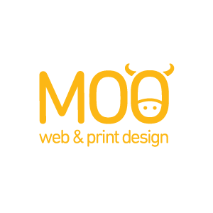
Andrea McDermott – Moo Web Design
My name is Andrea McDermott and I am joint owner, with business partner Katy Garlington James, of Moo Web Design. We create affordable and effective branding and website design.
I would like to share our experience replacing our own logo in 2018. Until this year we used a logo I had created using the word “MOO” in large letters. The font was manipulated to read as the word “COW” when viewed up side down. When pointed out to people, they were suitably impressed, but I felt our clever trick went unnoticed unless pointed out, so was lost on the majority of clients and potential clients. It seemed like a smart idea but it didn’t work the way we wanted.
Early this year, we embarked on a complete rebrand our business. We agreed we needed a logo that communicated the playful creativity we want to show as designers ourselves.
I changed the font from the very rounded Defused to Din Rounded, a condensed, less rounded but friendly font. I simply added horns and features evoking a cow’s head to one of the letter ‘O’s of the new font to create the logo. I love bold splashes of colour and chose lime and orange for our main brand colours to convey vitality and freshness. To finish, based in Scotland we are famous for highland cows so we used a beautiful image of a highland cow on our home page and with the new strap line “Stand out in your field”.
Since launching this new logo three months ago, together with the website and strapline our business enquiries have increased by 50%. Every client who contacts us refers to our branding. The success has taken us a little by surprise but it really is amazing how a strong logo really does work.

Cary Fielder – Clear22
Why is a strong logo and branding so important for a business?
A great logo and brand are of paramount importance for any business aiming to take itself seriously and that wants to make a unique commercial statement in the world. It should speak and deliver credibility, provide trust and stability to end-users with super efficiency and clarity. A good logo/brand gets remembered and talked about – essential for marketing impact.
Before a company does anything, developing their branding and identity should be of highest importance. respected, carefully considered and actioned, largely, without compromise and regardless of the company’s size and goal.
Re-branding requires no less attention and is no different to formulating a new brand but can be quite a challenge for a company especially if their existing brand has been established for a long period of time. Trends, company profile changes and adjustments within the market place often necessitate re-branding to ensure its profile is kept aligned and its message is correctly delivered.
In 2018, what elements and ideas specifically increase a logo’s effectiveness?
With every passing year we do see logo ‘trends’. Most noticeably, is the actual typeface that has been chosen. Since the millennium, we have seen the use of Serif typefaces fall steadily. However, this seemingly ‘out-of-favour’ font theme has still been used very effectively as a body copy and/or headline option.
For us in 2018, we too favour Sans Serif typefaces for their clean lines, modernist approach and the clarity they bring to a logo (a sign that we also help the trend to continue). As with any great logo, if used carefully and considerately it can also become very powerful just with typography – a logo without any graphical device should not be overlooked. We have found developed many powerful logos just using typography and probably have a slightly longer shelf life.
An effective logo should be ‘brave’ and not be shy to state its place in today’s world. Colour, if used, should be carefully selected and work well across print and online formats. Attention to detail of every single part of a logo should never be over-looked and ‘balance’ is an integral part of making everything come together effectively. It is with these rules and ingredients that Clear22 creates its logos and brands.

OLCO Design
Why is a strong logo and branding so important for a business?
“A business logo becomes the heart of any organisation and is often one of the most regularly used and seen brand asset. Brand assets form a brand identity and a strong brand identity can often become one of the most valuable intangible assets a company can own.” Oliver Cox, Director, OLCO.
“The creation of a strong logo and brand identity enables a business to become recognisable and distinguish themselves in ever competitive markets. A logo also provides an opportunity to visually communicate the tone, personality and values of a business.” Lauren Mills, Designer, OLCO
In 2018, what elements and ideas specifically increase a logo’s effectiveness?
“Gradients, subtle shadows and a sense of depth are key trends in 2018, but we believe they are not trends that are going to be short-lived. Big influencer brands have been adopting this type of design style in smartphones user-interfaces and apps for some time. We believe that rolling this approach into logo designs adds personality alongside a timeless, stylised logo that will stand the test of time. Like most designers, we also believe that less is more and the simpler the logo, the more effective it is.” Jake Warrilow, Designer, OLCO

